Spoonalysis: Mapping UK Chain Pub Prices
Wherein I take advantage of the location and menu data used by mobile ordering apps to determine precisely where in the UK you can get the cheapest microwaved lasagne accompanied by a Jagerbomb... sorry, I mean Strikabomb. Not very useful, but fun!
Not interested in the fluff and just want to have a look at the map? Aim your pointy arrow (or finger) at the following underlined blue text and thusly proceed: SpoonsMap
Introduction
The UK has a lot of pubs. A very significant amount of these are owned by chains of some sort. Sometimes they try to pretend to appear independent, with unique branding and names for each location. Others, like Hungry Horse and All Bar One, don't even bother with this charade, choosing to court people who want to go to a familiar location.
There's one which is almost inescapable: w e t h e r s p o o n (as their logo brands it). Colloquially known as "Spoons" to many, they're known for peddling cheap booze and mediocre food alongside political propaganda. They're in cities all over the UK (and now Ireland). They're in shopping centres. They're in airports. They've almost all got some kind of name that goes along with their theming - for instance, there's three called The Counting House, based in former bank buildings. There's four called The Last Post and one called The First Post, all based in former post offices.
I don't drink, and I don't really care for pubs, but I've been dragged into Spoons on various occasions. I guess they're OK if you want cheap alcohol and you don't mind the propaganda (the last time I was in one, every table had a menu, accompanied by a laminated sheet about how Brexit would bring cheaper booze or some shit like that).
The last time I was in London, I went to the LondonFurs meet and then followed folks along on the usual post-meet excursion to the Sir John Oldcastle (a Spoons just outside Farringdon station). I debated ordering some food but then realised that the prices seemed even higher than what I usually expected from Spoons. While you can order 'bangers and mash' for just £5.99 at the Counting House in Glasgow, the exact same item costs £8.29 at the Sir John Oldcastle.
So that raises an interesting question. They're doing heavy price differentiation (London is a more expensive area than Glasgow). How does this work exactly? What areas have the cheapest Spoons and the most expensive Spoons?
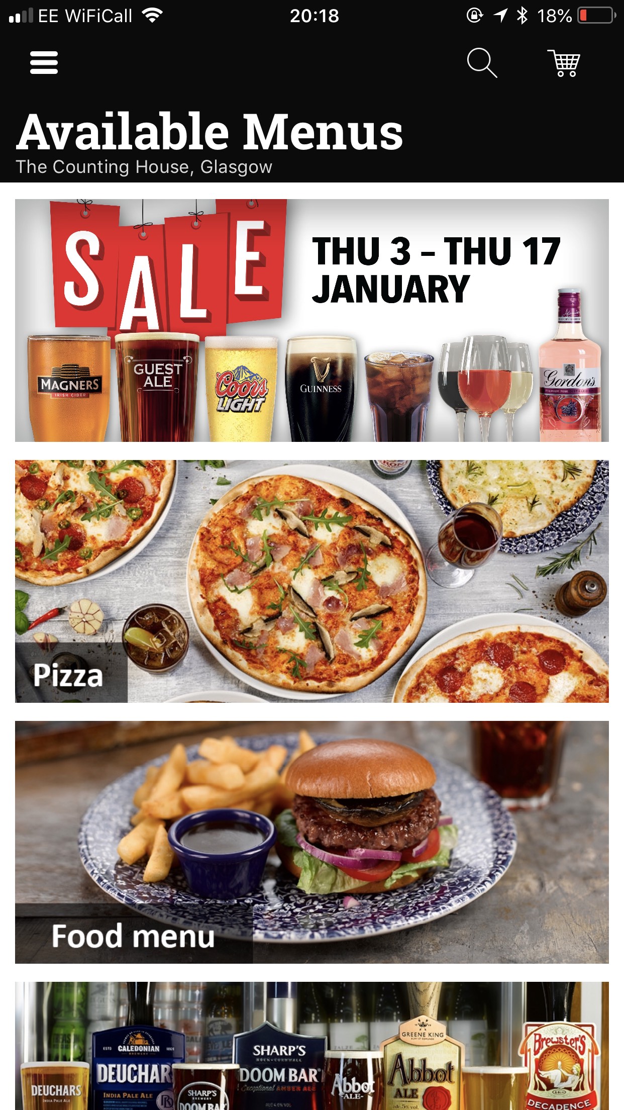
"Order and Pay"
One of their selling points is that they have a mobile app which allows you to order food and drinks, pay digitally, and have them brought to your table. It's actually not too bad. You can view everything that's on the menu at a particular location. It tells you what's out of stock, so you don't have to risk having your heart set on a creamy mushroom risotto and then realising at the last moment that it's unavailable and you have to pick something else.
I'm not interested in ordering food right now, though. What I want is easily accessible, consistent data on their pubs and prices - and crucially, that's exactly what this app includes!
Reverse-engineering the API is trivial. There's no SSL pinning on the iOS app (and probably on the Android app, although I didn't try that one), so setting up your decrypting HTTP proxy of choice (I use Charles) will allow you to see what the app is sending back and forth.
Every request is JSON, sent in an awkward wrapper, with a JSON response. No authentication is necessary past a static username/password which are hardcoded into the app. The Android app has no obfuscation, so finding out all the valid API request types and parameters (if you want more information than what you can derive from just looking at the app's communications) is trivial.
Can we fetch the list of pubs (or 'venues', as the API calls them)?
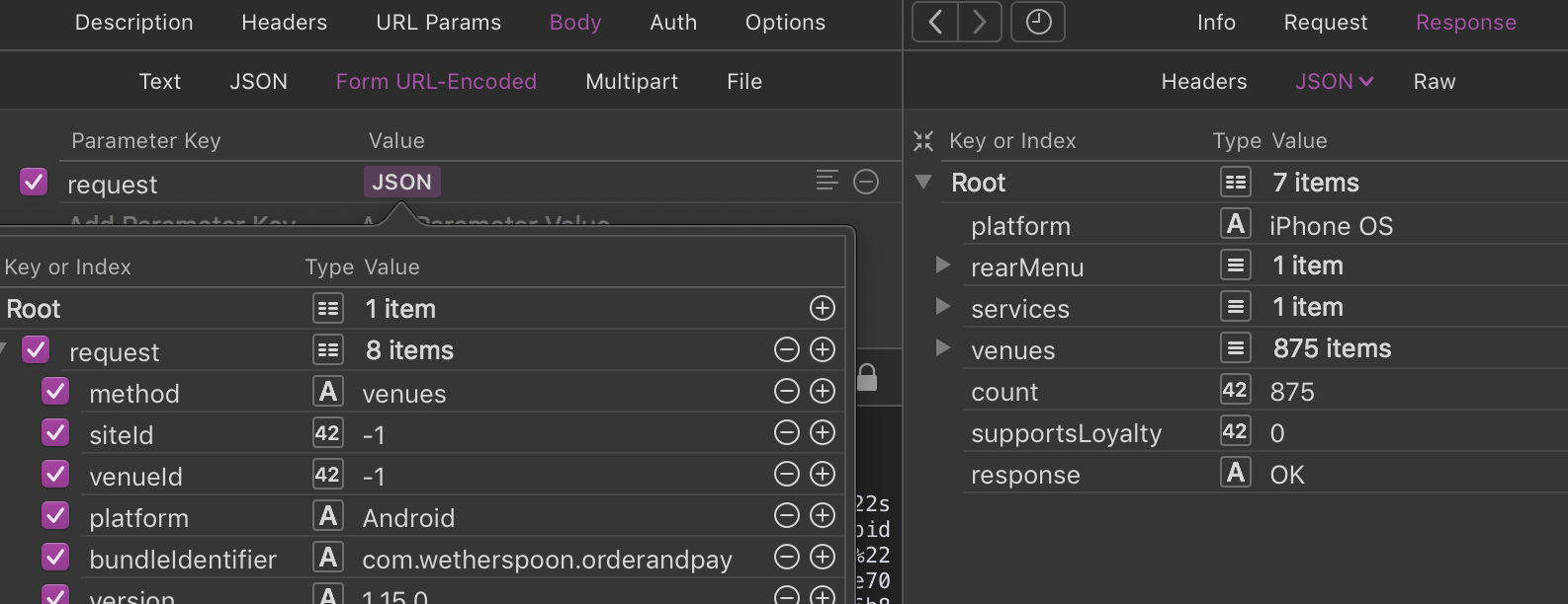
Yup! (Don't ask me why the server is telling me my platform is iPhone OS when I'm pretending to be an Android phone...) This gives me the information I want: every single location they have in the app (875 in total). For each one I get the currency, the list of 'sales areas' (each pub only has one, called Bar), the address, the GPS coordinates, and the ID. Armed with this, I can begin to start looking at the menus offered by each pub.
Analysing the Data
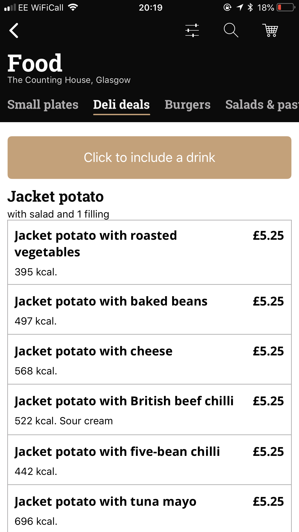
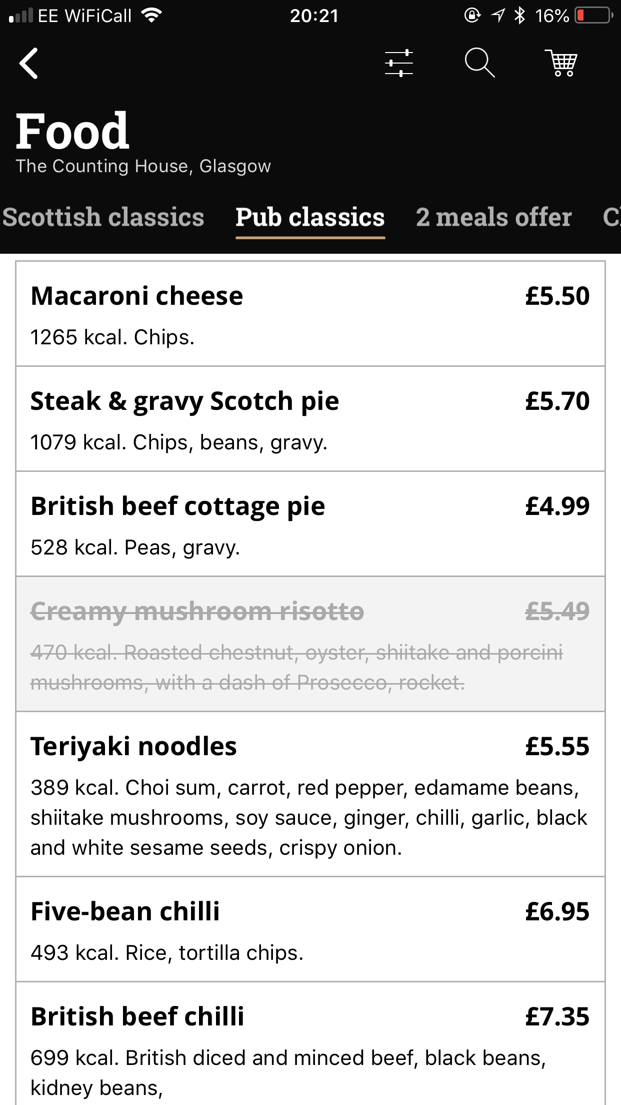
Each pub's offering is split into several menus: Sale, Breakfast, Pizza, Food, Drinks, etc. The amount and names vary depending on the pub: Pizza is only available in some pubs, for instance. Each menu has an internal name like Scotland Food September 18 or Main Drink September 2018, presumably to identify it in the back-end.
Sadly, we can't just look at these menus as a whole. Even though Main Drink September 2018 (ID 1868) is used by hundreds of locations, the precise contents of that menu varies across them. Some items are only available in certain locations, and prices vary.
For each menu, there's generally a few variations: there's a Main version used for most pubs in England and Wales, there's a Scotland version, there's a London version (usually, but not always used in London pubs), there's a Northern Ireland version and there's a Republic of Ireland version. Airports and the NEC (event space near Birmingham) also get their own menus.
A special shoutout goes to the pairing of airport food menus: Airport Non-Fried Food November 2018 and Airport Fried Food November 2018. Presumably some airports out there don't like fried food.
Also complicating matters is the fact that some menus only show up at specific times: the Breakfast menu is only visible during the morning, and there are promotional menus that only show up on certain days (Monday Club, Steak Club, etc). I've chosen to ignore the latter as finding the options and IDs would take all week. Literally.
Drilling into Menus
There's a fair bit of indirection going on in the data for individual menus, in order to allow parts to be shared. There are three main structures in the file that need to be handled: choice groups, products and display entries.
Display entries are the things that show up in the app's tabs: these can be subheaders, descriptive text, links to other menu sections (i.e. Click to include a drink) and references to products. Choice groups are lists of options that can be used to customise specific items, like choosing a mixer for a drink, choosing a kind of Pepsi, or selecting a side for a kids meal -- in fact, each option is a 'product' in itself.
Iterating through all the products will give you info about the available items and pricing, but since it also includes choice options, you'll get junk like "NO MIXER" and "Starter" (used to select whether an item is a starter or a main) which aren't really price-able things you can buy. As such, it's best to ignore the product list as a whole and look at the display entries instead, as that will reveal which products are top-level items and which are not.
To get a better picture of the whole system and confirm my understanding I wrote some code which converts the menu data for a particular location into a simple hierarchical text format. I've generated an example of what this looks like for one of the Glasgow locations (linked as it's rather large). It's admittedly a bit sloppy, but here's the code in question:
def process_product(product):
    product['displayRecords'] = {r['id']: r for r in product['displayRecords']}
    return product

def process_choice_group(group):
    for choice in group['choices']:
        choice['displayRecords'] = {r['choiceDisplayRecordId']: r for r in choice['displayRecords']}
    group['displayRecords'] = {r['id']: r for r in group['displayRecords']}
    return group

def parse_menu(menu):
    choice_groups = {g['id']: process_choice_group(g) for g in menu['aztec']['choiceGroups']}
    products = {p['id']: process_product(p) for p in menu['aztec']['products']}

    def display_product(prefix, product_id, display_record_id):
        product = products[product_id]
        display_record = product['displayRecords'][display_record_id]
        print('%s📦 %-40s <%-16s>' % (prefix, display_record['name'], product['eposName']), end='')
        if 'calories' in display_record:
            print(' <%4d cal>' % display_record['calories'], end='')
        print()
        if 'description' in display_record and display_record['description']:
            lines = display_record['description'].split('\r\n')
            print('%s  📄️ %s' % (prefix, lines[0]))
            for line in lines[1:]:
                print('%s    ️ %s' % (prefix, line))

        prefix += '  '
        for portion in product['portions']:
            display_portion(prefix, portion)

    def display_choice_group(prefix, choice_id, display_record_id):
        choice_group = choice_groups[choice_id]
        choice_display_record = choice_group['displayRecords'][display_record_id]
        print('%s🎲 %s [%s]:' % (prefix, choice_display_record['name'], choice_group['name']))
        for choice in choice_group['choices']:
            choice_display_record_id = choice['displayRecords'][display_record_id]['productDisplayRecordId']
            if 'productId' in choice:
                display_product(prefix + '  ', choice['productId'], choice_display_record_id)
            else:
                display_choice_group(prefix + '  ', choice['choiceId'], choice_display_record_id)

    def display_portion(prefix, portion):
        print('%s🍴' % prefix, end='')
        if 'price' in portion:
            print(' £%5.2f |' % portion['price'], end='')
        if 'supplementPrice' in portion:
            print(' supp:£%5.2f |' % portion['supplementPrice'], end='')
        print(' %-20s' % (portion['name']))
        prefix += '  '
        for choice_ref in portion['choices']:
            display_choice_group(prefix, choice_ref['choiceId'], choice_ref['displayRecordId'])

    for display_group in menu['display']['displayGroups']:
        print('%s' % display_group['groupName'])
        for item in display_group['items']:
            if item['itemType'] == 'hyperlink':
                print('    🔗 %s: %s' % (item['hyperlink']['text'], item['hyperlink']['link']))
            elif item['itemType'] == 'textField':
                print('    📄 %s' % item['textField']['text'])
            elif item['itemType'] == 'product':
                display_product('    ', item['product']['productId'], item['product']['displayRecordId'])
            elif item['itemType'] == 'subHeader':
                print('  %s' % item['subHeader']['text'])
            else:
                print('UNKNOWN itemType: %s' % item['itemType'])

for menu_def in get_menus(5052, 140)['menus']:
    print()
    print('*** %s <#%d %s> ***' % (menu_def['name'], menu_def['id'], menu_def['description']))
    print()
    menu = get_menu(5052, 140, menu_def['id'])
    parse_menu(menu)
Comparing Prices
Now that I have all the data and I know how to parse it, I can start doing some fun analysis! It's pretty easy to compare the prices of individual products among different locations.
Let's take the Strikabomb as an example. It's available in 855 of the 875 locations we have data for. (The other 20 are pubs in airports, in Ireland and a couple of other special cases.) The average price over all locations is £3.64. There is a wide variety of pricing tiers: pubs are offering it for £1.79, £1.99, £2.09, £2.15, £2.40, £2.59, £2.65, £2.89, £2.90, £2.99, £3.05, £3.09, £3.15, £3.25, £3.29, £3.35, £3.39, £3.45, £3.49, £3.55, £3.59, £3.65, £3.69, £3.75, £3.79, £3.85, £3.89, £3.95, £3.99, £4.05, £4.09, £4.10, £4.15, £4.19, £4.25, £4.29, £4.39, £4.40, £4.49, £4.65, £4.85 and £4.99.
There's only two pubs charging less than £2 (in Newport, Wales and in Sheerness, England). There's only one pub charging £4.99, and that's in Windsor, England.
That's just one item, though. It would be nice to get a bigger picture overview of the pricing. With 875 locations, having distinct pricing for every single venue seems a bit over-the-top, so I suspect there may be some sort of tiered price system in place. How can we confirm this?
I thought a good start would be to pick a bunch of common products, take the price for each from each pub's menu, and then compile this into a spreadsheet for better analysis. This proved to be a bit of a pain because the menu is surprisingly inconsistent -- there are very few items that all outlets offer -- and I was using the internal EPOS names to identify items, which aren't the same on all menus.
My hope was that doing this would reveal some form of price tiering. Unfortunately, it's not quite that simple. Prices don't go up linearly or in any sort of consistent fashion.
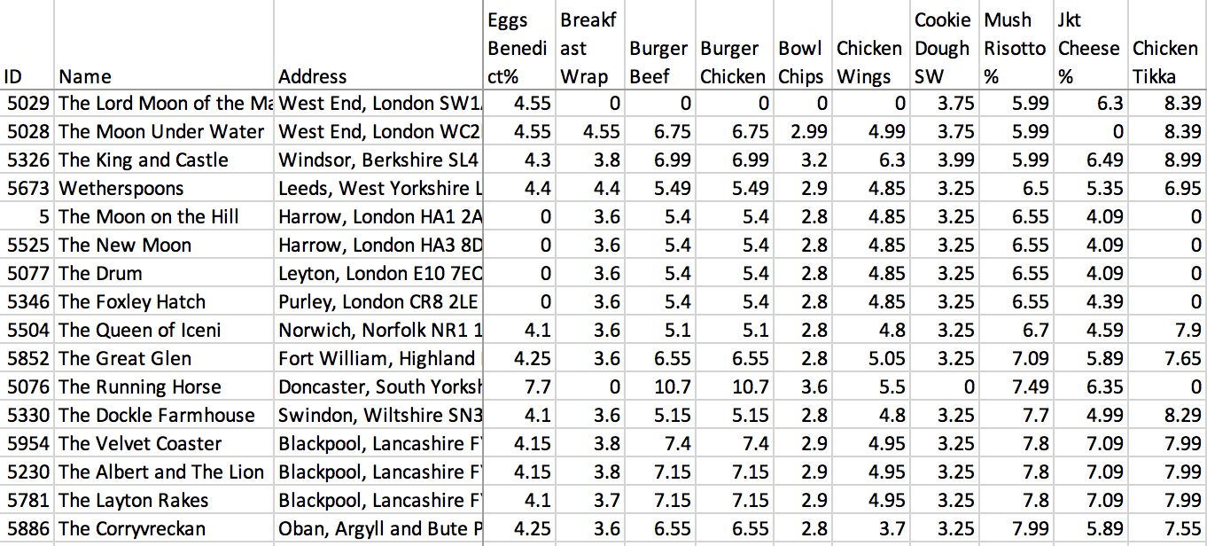
I sorted the table by the price of the Mushroom Risotto, a food item offered by all pubs but four. At the Corryvreckan, it's £7.99, more than any other non-airport venue in the UK. Chicken wings are however a mere £3.70, lower than any other pub in this screenshot. The King and Castle only asks £5.99 for the Mushroom Risotto, but they want a staggering £6.30 for chicken wings.
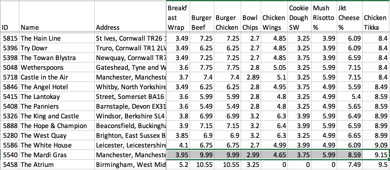
What about the jacket potato with cheese? The cheapest price it's sold at is £3.99, at 40 pubs across England and Scotland. The most expensive is £8.59 at one pub in Manchester. This pub also has the second most expensive Chicken Tikka and Beef Burgers outside of airports (beaten only by one of the Birmingham NEC's two pubs on both fronts), but it's fairly middle-of-the-road where chicken wings and chips are concerned.
In order to figure out the most expensive Spoons across the UK, we're going to have to come up with some kind of metric that takes into account the variations in price. It'll also need to account for the fact that not every pub carries the same range. The Mushroom Risotto (available at all but 4), Chicken Burger (all but 2) and Beef Burger (all but 3) are some of the most widely available items, but even those are not in every single pub.
I decided to first select an array of commonly available items that covered every section of the menu, as follows:
- Breakfast: Vegetarian breakfast, American breakfast, American-style pancakes, Eggs Benedict, Breakfast wrap, Vegetarian breakfast wrap, Toast and preserves, Scrambled egg on toast, Beans on toast, Fresh fruit, MOMA Porridge
- Food: Chicken breast bites, Chicken wings, Small nachos, Jacket potato with cheese, Cheese, mayo & tuna melt panini, Grilled chicken breast burger, Classic 6oz beef burger, Vegetable burger, Drive-thru beef burger, BBQ beef burger, Quinoa salad, British beef lasagne, 8oz sirloin steak, Mixed grill, All-day brunch, Freshly battered fish and chips, Whitby breaded scampi, Creamy mushroom risotto, Five-bean chilli, Chicken tikka masala, Triple chicken feast, Bowl of chips, Twelve onion rings, Warm cookie dough sandwich with ice cream, Fresh fruit with ice cream
- Drinks: Carlsberg, Foster's, BrewDog Punk IPA (by the pint), BrewDog Elvis Juice (by the can), Corona, Beck's, Estrella Galicia, Kopparberg Strawberry & Lime cider, Hooch, WKD Blue (by the bottle), Gordon's, Bombay Sapphire, Gin and Ting, Gin Fizz, Captain Morgan Original Spiced Gold, Ron Zacapa, Absolut, Grey Goose, Famous Grouse, Jack Daniel's, Southern Comfort (double), Jose Cuervo Especial Tequila (single), Chardonnay, Teresa Rizzi Prosecco (750ml bottle), Porn Star Martini (pitcher), Strikabomb, Fireballbomb, SOURZ Apple (single)
- Soft Drinks: Orange juice, Pepsi, Pepsi Max (glass), Monster Energy, Old Jamaica ginger beer, Sanpellegrino Limonata (can), Hot chocolate, Coffee, Tea (cup)
- Bar Snacks: Sea salt & balsamic vinegar Kettle chips, KP original salted peanuts
All of these items are available in over 800 outlets, minimising the amount of data we need to leave out. I tried to include at least two items from every sub-section, in order to ensure decent coverage of the menu.
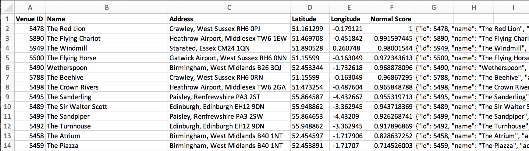
A bunch of Python later, I had some code spitting out a CSV containing the prices of these items in every single outlet. I excluded the five in the Republic of Ireland in order to avoid having to deal with currency conversion, leaving me with 870 venues to compare.

The next question is: based off these, how do we rank the Spoons? There's probably an incredibly easy way to do this that would be obvious to a statistician, but I'm not a statistician, so I'm just going to have to wing it.
My first thought was to simply average the prices together for each establishment, producing a value that should be a rough measure of the priciness of that establishment. This works to an extent -- all the airport outlets are pushed to the top because prices like £35 bottles of Prosecco bring the average up -- but there's significant room for improvement. Prosecco is given undue influence simply because it's the most expensive item on the sampled list, and cheaper items like Pepsi have very little influence on the result.
So, the next idea was to take advantage of percentile ranking. Excel has a PERCENTRANK.INC function which when passed an array and a value will return a value from 0 to 1 depending on where that value ranks in the list (0 for the minimum, 1 for the maximum). I used this to generate a percentile ranking for every price and then calculated the mean of the rankings for each establishment.
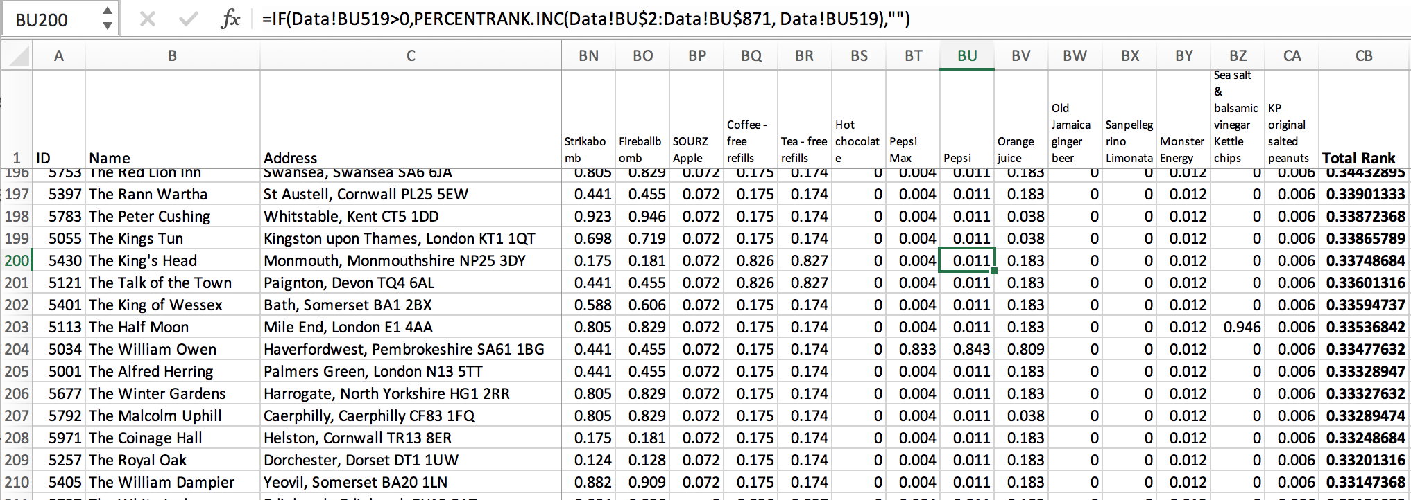
Doing this gives me values ranging from 0.05406579 to 0.99266667 - they never quite reach the extremes because there are no venues that have all-maximum or all-minimum prices for all the sampled items. Still, it's an improvement over the first attempt, as we're now giving equal influence to each item when considering the priciness of a pub.
The results look believable, as well. The top 14 under this metric are all airport locations (and we all know what airport pubs are like), followed by London locations. #34 is the Mardi Gras (home of the most expensive jacket potato) and #36 is the King and Castle (home of the most expensive Strikabomb).
There's one more tactic I can try: generating z-scores for the data using the STANDARDIZE function, and then averaging the z-scores. Doing this gives me values ranging from -0.7910854 (abnormally cheap pubs) to 6.79722422 (airport pubs). The results are somewhat different to the previous attempt but still seem to roughly check out - the venues we know to be expensive are all ranked highly as they should be, and the venues we know to be cheap are all ranked very low.
I plotted the three different kinds of ranks on a graph against each other for comparison's sake:
![]()
Here you can really see the drawbacks of the first method (Average, the blue line) - there's a sharp drop at the low end. These are two pubs where the food menus are entirely unlisted on the mobile app, so we have no data for them. The percentile ranking and z-score methods cope better with the absence of data and rank these pubs purely on their drink prices, so they fall somewhere in the middle.
There's a significant visible difference between the z-score and percentile approaches: ranking based off the percentiles results in a far more linear graph than the z-score method, as the z-scores are brought up significantly by outlier prices in a select few pubs (airport outlets and the two at the Birmingham NEC).
I don't think this is a bad thing per se - it makes sense to rank these highly because of their outrageously high pricing, and as such, I'm going to go with the Z-score approach.
I'm sure there's further room for improvement here, but I've gotten it to a level I'm reasonably satisfied with. You'll never be able to have a single perfect measurement, anyhow - the way prices vary mean you have situations where one pub is cheaper than others for certain items but not for others. So if all you're interested in is burgers, you might not care that a particular Spoons is charging the UK's highest price for jacket potatoes.
So, what comes next? Creating a map!
Maps
I exported my calculated data from Excel into JSON using some unholy formulas and then started looking into map APIs. I didn't particularly want to give Google my card details to use the Google Maps API, so instead I decided to try out Leaflet. I'm incredibly impressed by it: it's regularly maintained (the last release was just over a week ago), has a straightforward API, excellent documentation (both API and narrative) and a good plugin ecosystem. I wish more libraries were like this.
I had my mind set pretty early on how I wanted to present the map - markers for each individual location colour-coded to show how pricey they are. I wasn't quite sure how well this was going to work or how easy it would be to pull off (spoiler: really easy with Leaflet) but I figured I'd try.
The hardest bit ended up being getting the colour-coding right - I wanted to do a red-amber-yellow-green sort of thing, but it took some trial and error to get it to look the way I envisioned.
The exponential curve on the Z-score-based indices meant that I couldn't just map it linearly onto a gradient. I ended up looking at the conditional formatting available in Excel for a bit of inspiration...
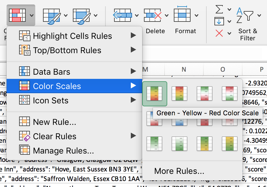
Applying it and examining the rule in detail showed me how it worked: a three-point scale from green to yellow to red. I took this as a starting point, but adjusted the green to make it more vibrant (the original shade was too similar to the green used on the map itself) and moved the midpoint down significantly. Setting a threshold at 0.1 means that the 154 most expensive pubs fall into the yellow-red range, and the remaining 716 are spread across the green-yellow range. I ended up with this, which I'm quite pleased with:
function lerp(min, max, value) {
    return min + value * (max - min);
}

function getColourForScore(score) {
    var r, g, b;
    var threshold = 0.1;
    if (score < threshold) {
        // green - yellow range
        var value = score / threshold;
        r = lerp(25, 255, value);
        g = lerp(255, 235, value);
        b = lerp(10, 132, value);
    } else {
        // yellow - red range
        var value = (score - threshold) / (1 - threshold);
        r = lerp(255, 248, value);
        g = lerp(235, 105, value);
        b = lerp(132, 107, value);
    }
    var darkenFactor = 0.2;
    var fill = 'rgb(' + Math.round(r) + ',' + Math.round(g) + ',' + Math.round(b) + ')';
    var stroke = 'rgb(' + Math.round(r * darkenFactor) + ',' + Math.round(g * darkenFactor) + ',' + Math.round(b * darkenFactor) + ')';
    return [stroke, fill];
}
And here's how that looks:
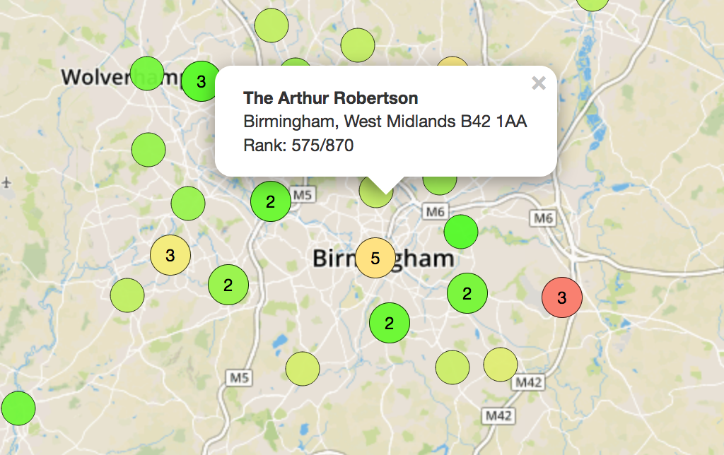
You can find and browse the completed map here: SpoonsMap
Thanks for reading my foray into Spoons pricing. I don't even like the place... but I couldn't resist doing some analysis on it :p
Think I should explore something else? Send me ideas and/or feedback on Twitter: @_Ninji
Previous Post: Mouse Adventures #8: Dissecting the USB Code and Unbricking the Mouse
Next Post: Pulling apart the Cosmo's SystemFOTA updater